Designing the Commercial Office of Tomorrow, Inspired by Pantone’s 2026 Colour of the Year
[heading_size] => h1
[sub_heading] =>
written by OLG
[cc_columns] => Array
(
[first_column] =>
As commercial workplaces continue to evolve, design is increasingly judged not just on aesthetics, but on how well it supports focus, wellbeing, and flexibility. Inspired by Pantone’s 2026 Colour of the Year, designers are embracing calm, neutral palettes as a foundation for offices that feel considered, human, and future ready.
As Steve Jobs famously said, “Design is not just what it looks like and feels like — design is how it works.” That sentiment resonates strongly in today’s office environments, where colour, materials, and furniture must work together to enhance performance as much as appearance.
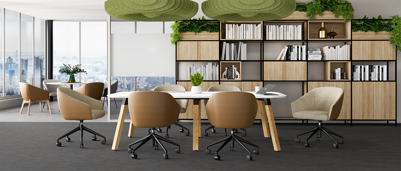
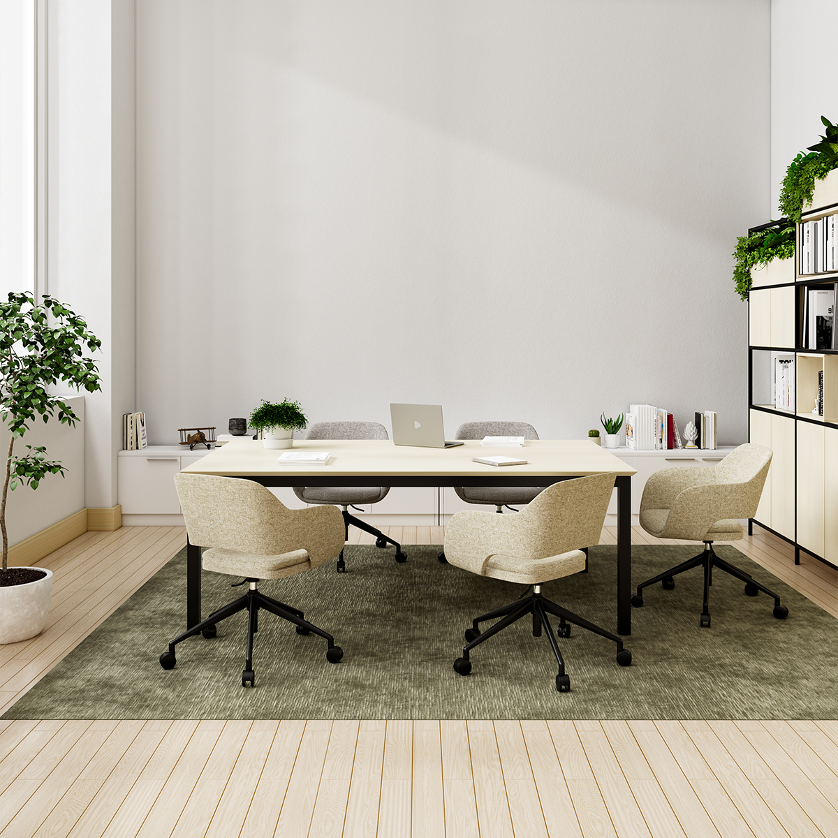
A Calm Foundation for Focus and Collaboration
The Pantone 2026 colour provides a soft, adaptable base that reduces visual noise, an important consideration in open-plan offices. When applied to feature walls, joinery, or acoustic panels, the colour helps create visually calm zones that support concentration while still feeling contemporary and welcoming.
Acoustic panels upholstered in complementary tones not only improve sound control but also become a key design feature, proving that functional elements can enhance the overall aesthetic rather than detract from it.
Layering Texture Through Furniture and Materials
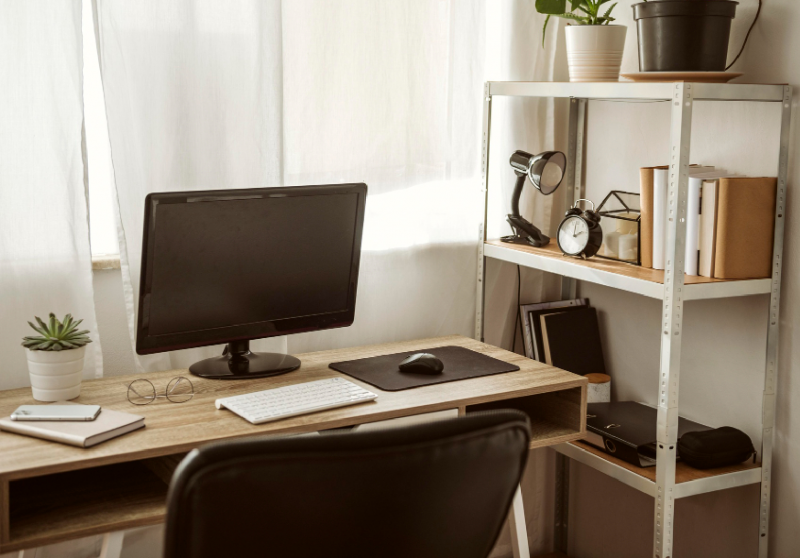
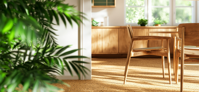
Rather than relying on colour alone, designers are increasingly layering texture and materiality to create depth. Light timber finishes, tactile fabrics, and matte metal details pair effortlessly with neutral palettes, giving commercial interiors warmth and sophistication.
This approach translates seamlessly across OLG Office furniture categories, from:
Workstations and Desking systems that feel light and uncluttered.
Task and soft seating upholstered in tonal fabrics for comfort and visual cohesion.
Storage and breakout furniture that blends into the space rather than dominating it.
Thoughtfully specified furniture not only elevates the look of an office but supports long-term usability and employee satisfaction.
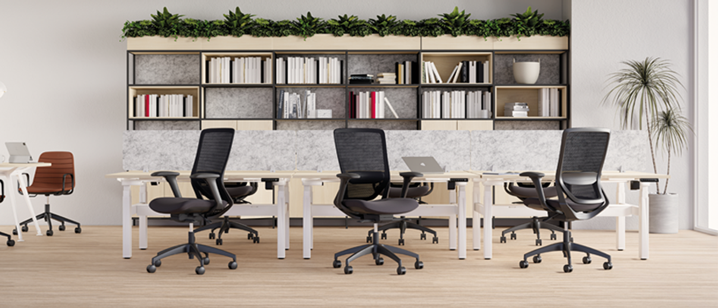
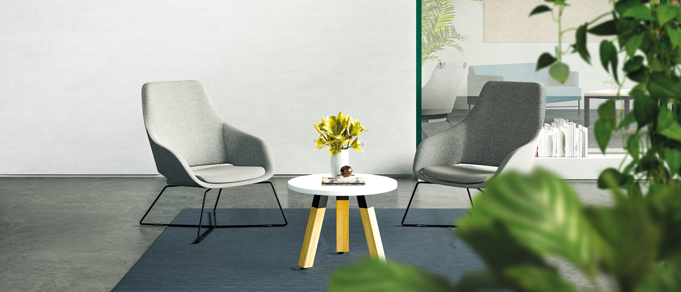
In flexible, activity-based workplaces, zoning is essential. Neutral colour palettes allow designers to use acoustic panels, planters, and soft furnishings to subtly define areas for collaboration, focus, or informal meetings without fragmenting the space.
Biophilic elements such as planter boxes, natural textures, and access to natural daylight work particularly well alongside muted colour schemes. These elements reinforce wellbeing, reduce stress, and help offices feel less corporate and more restorative.
As designer Gere Kavanaugh puts it, “I love colour; I could eat colour.” In modern offices, that love of colour is expressed not through bold saturation, but through carefully balanced palettes that allow people and nature to take centre stage.
Where Function Meets Emotion
Colour plays a powerful role in shaping how a space is experienced. As many designers note, colour is where function meets emotion, a principle that applies directly to commercial interiors. When paired with considered furniture selections, acoustic comfort, and biophilic design, the Pantone 2026 colour becomes more than a trend; it becomes a tool for creating spaces that support how people actually work.
The commercial office is no longer just a place to work, it’s a place to connect, create, and feel supported throughout the day. By combining a calm colour foundation with acoustic solutions, biophilic elements, and thoughtfully curated Office furniture, designers can deliver workplaces that are both highly functional and emotionally intelligent.
Pantone Color of the Year 2026™ images courtesy of Pantone LLC.
Biophilic design in 2025 will move beyond aesthetics to measurable outcomes. Designers will use nature-inspired elements like circadian lighting systems to enhance productivity and reduce fatigue. Beyond plants and natural materials, expect data-backed integration of features like air purification systems using green walls or sensory experiences.
Designing the Commercial Office of Tomorrow, Inspired by Pantone’s 2026 Colour of the Year
HomeBlogDesigning the Commercial Office of Tomorrow, Inspired by Pantone’s 2026 Colour of the Year
Designing the Commercial Office of Tomorrow, Inspired by Pantone’s 2026 Colour of the Year
written by OLG
As commercial workplaces continue to evolve, design is increasingly judged not just on aesthetics, but on how well it supports focus, wellbeing, and flexibility. Inspired by Pantone’s 2026 Colour of the Year, designers are embracing calm, neutral palettes as a foundation for offices that feel considered, human, and future ready.
As Steve Jobs famously said, “Design is not just what it looks like and feels like — design is how it works.” That sentiment resonates strongly in today’s office environments, where colour, materials, and furniture must work together to enhance performance as much as appearance.
A Calm Foundation for Focus and Collaboration
The Pantone 2026 colour provides a soft, adaptable base that reduces visual noise, an important consideration in open-plan offices. When applied to feature walls, joinery, or acoustic panels, the colour helps create visually calm zones that support concentration while still feeling contemporary and welcoming.
Acoustic panels upholstered in complementary tones not only improve sound control but also become a key design feature, proving that functional elements can enhance the overall aesthetic rather than detract from it.
Layering Texture Through Furniture and Materials
Rather than relying on colour alone, designers are increasingly layering texture and materiality to create depth. Light timber finishes, tactile fabrics, and matte metal details pair effortlessly with neutral palettes, giving commercial interiors warmth and sophistication.
This approach translates seamlessly across OLG Office furniture categories, from:
Workstations and Desking systems that feel light and uncluttered.
Task and soft seating upholstered in tonal fabrics for comfort and visual cohesion.
Storage and breakout furniture that blends into the space rather than dominating it.
Thoughtfully specified furniture not only elevates the look of an office but supports long-term usability and employee satisfaction.
Zoning with Acoustic and Biophilic Elements
In flexible, activity-based workplaces, zoning is essential. Neutral colour palettes allow designers to use acoustic panels, planters, and soft furnishings to subtly define areas for collaboration, focus, or informal meetings without fragmenting the space.
Biophilic elements such as planter boxes, natural textures, and access to natural daylight work particularly well alongside muted colour schemes. These elements reinforce wellbeing, reduce stress, and help offices feel less corporate and more restorative.
As designer Gere Kavanaugh puts it, “I love colour; I could eat colour.” In modern offices, that love of colour is expressed not through bold saturation, but through carefully balanced palettes that allow people and nature to take centre stage.
Where Function Meets Emotion
Colour plays a powerful role in shaping how a space is experienced. As many designers note, colour is where function meets emotion, a principle that applies directly to commercial interiors. When paired with considered furniture selections, acoustic comfort, and biophilic design, the Pantone 2026 colour becomes more than a trend; it becomes a tool for creating spaces that support how people actually work.
Looking Ahead
The commercial office is no longer just a place to work, it’s a place to connect, create, and feel supported throughout the day. By combining a calm colour foundation with acoustic solutions, biophilic elements, and thoughtfully curated Office furniture, designers can deliver workplaces that are both highly functional and emotionally intelligent.
Pantone Color of the Year 2026™ images courtesy of Pantone LLC.